
Interim Critique
Posted: February 24, 2016 Filed under: Field Leave a comment
 Today we had interim critiques in front of the tutors, this involved a short four to six minute presentation explaining what we’ve done so far and what we intend to do in the up coming weeks. The main purpose of this presentation was to prepare us for our external examiner visit next week and to also take some constructive criticism to improve and build on our work.
Tutors: Keiriene Canavan and Sally Grant
My presentation was at 10 am so I started it off with a big good morning to both tutors, I went on to introduce my theme, inspiration and why it was I choose the Cornish coast.
- Coastal walks and trips to the beach
- Imagery over the summer and winter break
I briefly spoke about my inspiration board – taking some feedback from keiriene at the beginning of the project, not just see my photographs as seascapes but to look at them from different perspectives and to think about the textures and colours within them.
Wrote my brief after having a tutorial with Jane – she asked to me think about the concept behind all the ideas and what is it about Cornwall that interests me. This was a really helpful tutorial!
- Recent news in Cornwall
- Sea storms
- Pollution
- Sea waste
- Sewage
I then gave a summary on each of my mood boards:
Theme – my own imagery with two pictures from the internet. Talked about ‘collections’ and what I’ve picked up from walks on the beach like shells or drift wood. The 18,000 pink bottles that washed up on the Cornish coastline January this year.
Colour – All colours choosen have a meaning, all but two of them are sourced from a colour atlas from my images.For example pink to represent the flowers on the cliff and the mysterious pink bottles washed up.
Client Board – Aimed at people aged 20-45 with a high disposable income wanting a ‘home from home’ feel to their soft furnishings.
Market Competitors – Coincides with the client, sourced and researched companies with the same target market.
Products – For the final show I’d like to design interior living/bedroom accesories like a patchwork quilt and matching pillows.
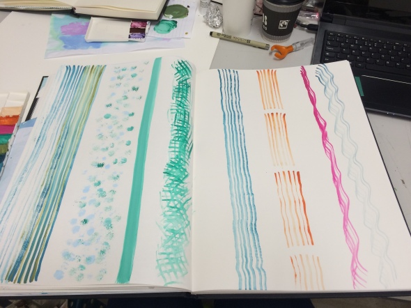
Techniques – I rounded the presentation off by talking about the techniques I’ve been experimenting with like shibori, dyeing, heat transfer, marbling and beginning to do some digital stitch. Also added in that I’m trying to utilise the idea of ‘collections’, incorporating found and natural objects into the making process. The next step was to create exact colours from my palette and log this in my sketch book.
FEEDBACK
First comment made by both tutors, not to be so nervous and to be confident when speaking about my work. Something I know I lack in but I will try my best to improve this, especially for next week.
I had a feeling this was going to be brought up but Keiriene did mention the black border around my mood boards, that it was very heavy and this detracts from the images. I did take her feedback to do this the week before however because I was unsure about them I only blue tacked it down therefore was more than happy to take this off and to also paint over the mixed blue boarders underneath as that also too busy.
Sally said that she really liked the large projector drawings I’d done and to think about using these in the final collection OR to take sections of them and produce some smaller samples.
Although I’d already considered natural fabrics for soft furnishings, Sally did mention that she liked the silk habotia shibori samples I’d done and to think about using silk – after all silk is natural as it’s made from protein. Adding to this she also said she could almost take one of my drawings and see this onto a thin silk curtain floating in the window. I will definitely consider this idea and experiment with it further.
Both tutors said that they like the idea of ‘going big’ and to be very confident in taking this idea further into the project. That my development so far seems very developed and ‘bespoke’ – an idea that a lot of people would respond to.
A final comment was made by Sally about not getting to caught up with the recycling side of it but to include it in a subtle way. I would agree with this comment to an extent however this is still the development stage and who knows where it’ll take me. I intend to experiment with found objects in the dye room and I’ll review this comment again at a later stage.
Overall I think I highlighted all the important things relevant at this stage. I did go over the time by about 15-20 seconds so I intend to practice more with presenting. I think I’m going to struggle to narrow it down to two minutes because I’ve go so many ideas. The feedback has really helped me to understand where I am at this stage in the project and to carry on with my design development.
Mark Making
Posted: February 22, 2016 Filed under: Field Leave a commentOnce I was completely happy with my improved colour board, I began to create my palette using gouache paints. I doing so I was able to start adding colour to my current sketches and mark making using various brush types. I will continue to do this experimentation but to a larger scale, perhaps A1 or A2 loose sheets of paper.

Quick mark making experiments using a fan brush and stippling brush, referring back to my Cornish coast imagery. These simple design ideas could potentially be translated into backgrounds or repeat designs.
Improved colour board
Posted: February 22, 2016 Filed under: Uncategorized Leave a commentToday I changed two colours on my colour board, I felt as though the darkest blue was too similar to the navy blue and the deep red wasn’t at all relevant and clashed with the bright pink. None of the tones from the colour atlas I produced fit the overall palette therefore I choose to source new colours from the Pantone website, a reliable source I’ve used before that gives you the RGB codes. I replaced the deep blue with a teal green to uplift the brighter tones already within my palette. The red is now a soft beige called ‘bleached sand’ I feel as though this could act as a base colour within my designs and calms the overall mood of the palette.
Here is my updated colour board.

Mixed media mark making
Posted: February 19, 2016 Filed under: Field Leave a comment
Today was a studio day, at this stage in the project I still feel as though my sketch book is okay but needs more development therefore I choose to dedicate a couple of hours doing some mark making using oil pastels, paints, inks and using my paper marbling samples I did the week before. The image above is a page in my sketchbook where I started to layer paints, tear bits of paper to add in areas, constantly referring back to my inspiration board. The designs created are meant to be very abstract and they don’t necessarily need to make sense as I’m drawing sections from various images. I’m really enjoying this design method, its very free flowing and unpredictable.
Chanel N°5 Workshop
Posted: February 18, 2016 Filed under: Uncategorized Leave a comment

Today a group of us were lucky enough to be part of a Chanel N°5 Workshop and were told that this is the first workshop presented to students. This was a great opportunity to learn something new, to understand how this perfume is made and how it originated, a field I wasn’t really aware of.
We were told that the Chanel N°5 perfume is made up of 82 different scents, during the talk we sampled around 12 of these. We learnt the three tones that make up the perfume, which were the low tones, middle and high tones, how each scent complements one another and this process impacts how long the scent lasts on the skin.
We were each give tester strips and asked to share what we thought each smelt like and how that particular scent made us feel or if it provoked a memory. It was interesting to listen to other people thoughts on this, for example the first tester was white musk which most people said reminded them of there nan or mother, even a summer day.
It was also really interesting to find out more about the history of the perfume, the fact that the ingredients haven’t changed for almost 100 years and they make sure they source each in a sustainable and environmentally friendly way. Chanel had a fond obsession with the number 5 and this remains an ongoing theme, even to this day events and shows open on the 5th of the month.
Overall an insightful and interesting workshop I’m glad I attended, were we fortunate enough to leave the workshop with a sample of the newest N°5 perfume to have our own Marilyn Monroe moment.
Heat transfer experiments and dye bath refresher.
Posted: February 15, 2016 Filed under: Uncategorized Leave a commentToday was a workshop day, I decided to carry on experimenting in the print room with my Cornish coast , storm and pollution theme as my inspiration. I choose heat transfer inks that fit my colour palette with my colour atlas print out as a guide as well .  Working with A4 sheets of paper I manipulated the inks by applying different brush strokes, dampening the paper first and dripping the inks down the page creating unpredictable marks and implementing movement to the designs.
I found that the inks on the paper completely changed in colour after applying them onto various fabrics under the heat press, each time being pleasantly surprised with the outcomes. Some experiments came out better that others depending on the design and fabric. My favourite fabric during this process was definitely the synthetic moleskin, not only does it have a soft surface texture but the colours that came out onto them were amazing.
Here are some of the outcomes:
These samples are both onto moleskin fabric, I really like the simplicity of the lines and marks against the intensity of the colour. Another technique I could integrate into my collection with stitch marks incorporated on top, potentially to produce a bespoke outlook to some of my final designs.


DYE BATH REFRESHER

I did a quick dye bath refresher with Steve which is a technique I wanted to re-visit from my first year. The reason for doing this technique is because I feel as though I will be able to control the colours by recording all measurements yet the outcomes will differ in marks and patterns which creatively links to my theme.
The dye bath process has the use of dye chemicals, salt and vinegar which in some ways links to the sea and pollution such as oil spills and sewage.
I intend to utilise found materials from the beach and recycled objects to wrap the fabric around, for example to wrap found fishing rope around a plastic bottle and leave that on the surface of the dye bath to see what happens, this connecting to the idea of pollution.
I set up three dye baths, all of which work well with natural or organic fabrics and can be mixed together to make different colours.
- Procian dye – Raspberry (pink) dye
- Procian dye – Indigo navy dye
- Dyrect dye – Sky blue
The reason for choosing natural fabric for this project is because the company I’m basing my work on called ‘Seasalt’ try to use sustainable materials as often as possible. The dye process works well with natural fibres and again it links nicely to my idea of raising awareness with pollution and trying to ‘make a difference’.
These are the fabrics I choose to start experimenting with however I’ll narrow these down to four or three for my final collection. The longest experiment only came to 25 minutes for each dye bath as it was almost five o’clock by that time and needed to pack up. I found that the dyrect sky blue worked the best but I next time I’ll put it in for longer.


Valentines Bake Sale
Posted: February 12, 2016 Filed under: Field Leave a comment
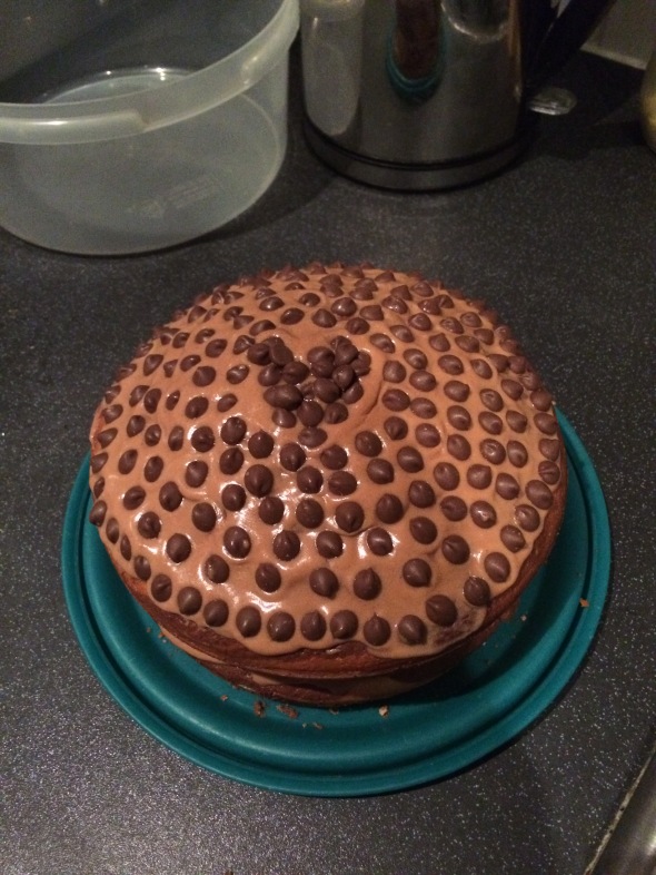
 Today we did a Valentines day themed bake sale to raise money towards our degree show! A lot of effort was put in from the textile third years to fill the stall with baked goodies. A small team of us rotated on the stall every two hours and we were able to raise £91.00 in total which was brilliant.
Chocolate and vanilla marble cake I baked!!
Projector Drawings
Posted: February 10, 2016 Filed under: Field Leave a commentI’ve been doing some drawing and mark making in my small sketchbook containing my 6×4 photographs and a few in my A3 sketchbook. During the process of this course I’ve found that I confine myself to my sketchbooks and thought it was about time I went bigger in terms of my drawing/mark making. During one of my tutorials Keiriene suggested I use the projector to blow up my images onto a wall, I took her advice and decided to layer my drawings on top of one another which gave me some interesting marks to work from.
I found this way of drawing interesting and inspiring, a technique I’d consider for future projects. I was a very free flowing process and I wasn’t 100% sure what to expect especially when taking a step back from it.


After adding some colour I felt as though the drawing started to come to life. I really like the fact that this is a summers day layered on top of a storm but you wouldn’t necessarily know that at first glance. I feel as though this drawing, or sections of it could be translated into stitch in an abstract way.
Marbling Technique
Posted: February 9, 2016 Filed under: Field Leave a commentMy theme is based on the Cornish coast and most of my own imagery is based around the sea from different angles and perspectives. This got me thinking about how can I translate ‘the sea’ using different mixed media techniques and textiles. To get the ball rolling on this project I decided to try a technique called marbling, this is where you add a thin layer of water to a flat surface or tray and simply add drops off ink to it, preferably oil based inks. Using a cocktail stick or end of a pencil gently mix the inks to create a marble effect.Get either paper, card or fabric and place it flat onto the surface of the water for a few seconds and the inks should stick to the surface revealing a marble like effect.
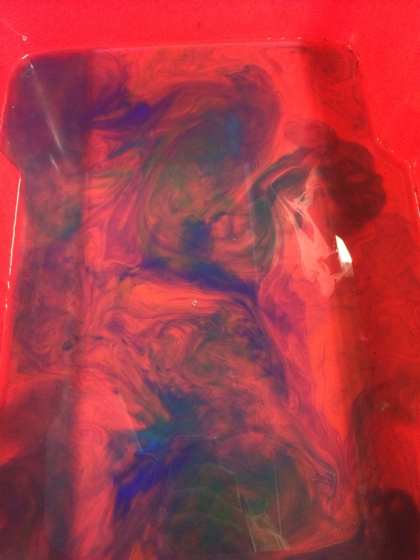
I really like the many different effects you can create, it’s very unpredictable, much like a storm which links to my theme.However I did find it difficult to control the colours during the process, perhaps next time I’d consider using the proper marbling inks rather that the silk paint inks, both of which use the same process.
This technique could be scanned in and used as backgrounds in digital designs or potentially stitched into using the right fabrics.
Here are my outcomes, majority onto paper or card.


Mood Boards
Posted: February 8, 2016 Filed under: Field, Uncategorized Leave a comment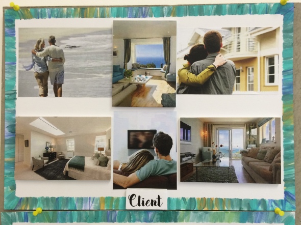
My target market aimed at couples aged between 25-45 with a high disposable income, I wanted to capture these aspects in my client board. Images to include bedroom and living space, I intend to design for interior home wares such as pillows, blankets or quilts to add comfort to an open space. I believe I’ve achieved this within the six images above.

My theme is based on the Cornish coast, I’m focusing on storms and environmental aspects in particular. I’d like express these ideas with the use of found washed up objects and utilising them throughout this project, for example I’d like to use fish netting to print with or rope to tie around fabric to then dye it. Above I’ve included imagery of my own and a few sourced online. I’ve also displayed two shibori samples from first year and some found objects from ‘beach combing’.

Above is my defined colour pallet, I choose to do a colour atlas using my own imagery on Photoshop and from that picked 10 colours that I thought went together. Due to my project being based on storms and the environment, I decided to take the colours mostly from my summer imagery adding in bright colours to enlighten the pallet.

My client board and market competitor board need to coincide with one another, therefore I needed to research companies that fit the higher market criteria with similar products and price range. I felt that Next, Marks & Spencer, Joules, John Lewis and Cath Kidston were a similar match in most areas to my chosen company Seasalt.

Recent Comments